The Wristband That Hid Its Own Brand
A few years ago, I helped a friend organize a regional tech conference. We ordered custom fabric wristbands for 1,200 attendees. We put the company logo right in the center of each band. Looked great on the proof. But at the event, I noticed a problem. Half the people wore the wristband with the logo facing down against their skin. Others had watches or long sleeves covering the logo. The brand was barely visible in photos. Attendees kept asking, “Which company is hosting this?” That was a missed opportunity. Since then, I have learned that logo placement on wristbands is not a trivial detail. It directly affects how many times your brand gets seen. Let me walk through what works and what does not.
Dead Center Works for Some, But Not All
Center placement is the most natural choice. You look at a rectangle of fabric or silicone, and you want to put your logo in the middle. It is balanced and easy to print. For a silicone wristband that is stiff and does not rotate easily, center placement can be fine. The same applies to wide, non elastic bands where the logo area is large. However, on a soft fabric wristband that twists and slides around the wrist, a single center logo often ends up underneath the wrist. Think about how people wear these things. They pull the band, it twists, and the logo disappears. I have seen event photos where the camera catches the inside of the wristband instead of the logo. So before you commit to center placement, consider the material and how freely the band moves.
Print It Twice or Place It Near the Closure
A better approach for most fabric wristbands is to use repeated logos or place them near the closure. Printing the same logo two or three times along the length of the band means no matter how it rotates, at least one logo is visible. Many promotional products experts recommend this as the “always visible” rule. Another smart spot is near the closure, either right next to the adhesive or snap. That area tends to stay on the top side of the wrist because the closure is often the heaviest or stiffest part. For a wristband with an adjustable slider, the area near the slider is rarely hidden. I once worked with a charity run that printed their logo in three places: near the start, in the middle, and near the end. Runners loved it because they did not have to adjust their band to show support. The cost increase for extra printing is minimal compared to the extra brand impressions.
When the Logo Becomes the Wristband Shape
Now here is a creative idea that solves the placement problem completely. Instead of printing a logo on a standard rectangle, make the wristband itself shaped like your logo. A European tech firm did exactly this for their annual conference. They ordered custom cut out wristbands from a manufacturer. The wristbands had a circular outline with brand cut outs inside the circle. Essentially, the entire wristband was a wearable logo. Every time someone looked at their wrist, they saw the brand shape. There was no way to hide it. This approach works especially well for short term events where you want maximum brand impact. It does require a manufacturer who can do precise cutting and handle non standard shapes. But the return on brand recognition is huge. In the actual case from VIBBON, that tech company enhanced brand recognition dramatically compared to previous years when they used standard printed wristbands.
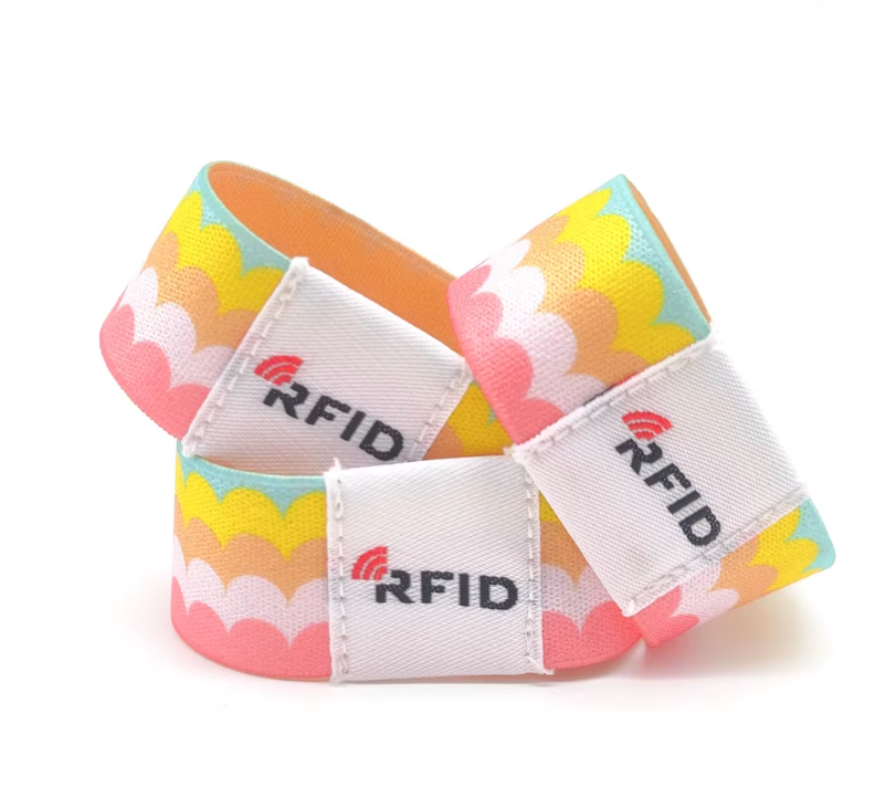
RFID Chips, Medical Info, and Logos Need Their Own Space
Logo placement cannot ignore functionality. If you order RFID wristbands, the chip and antenna are usually embedded in a specific area, often a rigid plastic pod or a reinforced section of the fabric. You must not print your logo over the chip because the ink or pressure could damage it. The manufacturer will mark the safe zone. Keep your logo away from that zone. For medical identification wristbands, patient data like name, birth date, and barcode must be clearly readable. The logo should go to the far end, near the closure, leaving the central area for critical information. Hospitals have strict standards from organizations like AAMI (Association for the Advancement of Medical Instrumentation) about where printing is allowed. For entertainment wristbands used in water parks, the logo should be printed with UV resistant ink and placed on a part that does not constantly rub against a life jacket or seat. These practical constraints mean you should discuss placement with your manufacturer early, not after the design is final.
Let the Maker Guide You to the Right Placement
Choosing the best logo placement is not guesswork. It depends on your wristband material, width, closure type, and how long people will wear it. A supplier with its own factory and design experience can make concrete recommendations. For example, VIBBON has been making identification wristbands for over 18 years. They have handled everything from newborn hospital bands to music festival RFID wristbands. Their full customization service covers size, logo, material, packaging, and accessories. They have actual cases like the European tech firm‘s logo shaped cut outs and the recycled fabric wristbands for eco brands. Their own factory and complete supply chain mean they can test different placements on samples before mass production. So when you order custom wristbands, do not just send a logo file. Ask the manufacturer: where should this logo go for maximum visibility and durability? An experienced partner will check your artwork, consider the band’s flexibility, and suggest repeating the logo, shifting it to the end, or even cutting the band into your logo shape. Getting placement right costs almost nothing extra but multiplies your brand exposure. After my conference mistake, I never assume that center is best anymore. I talk to the maker first.